DESIGN BRIEF
Retro's Brick Baked is a mock pizza brand I developed; This study of brand identity tried to capture the aesthetic of a classic Italian pizza brand, with a focus on presenting nostalgic 20th century American branding (calling back to the 1960's and the invention of the modern pizza box) while also maintaining a modern presentation.
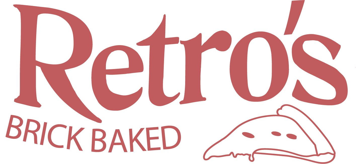
LOGO BREAKDOWN
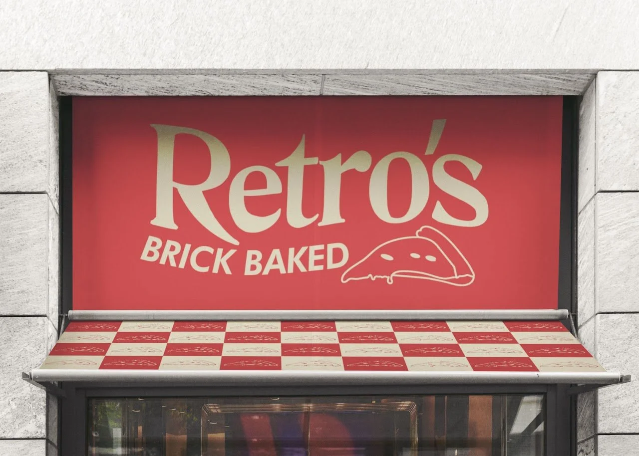
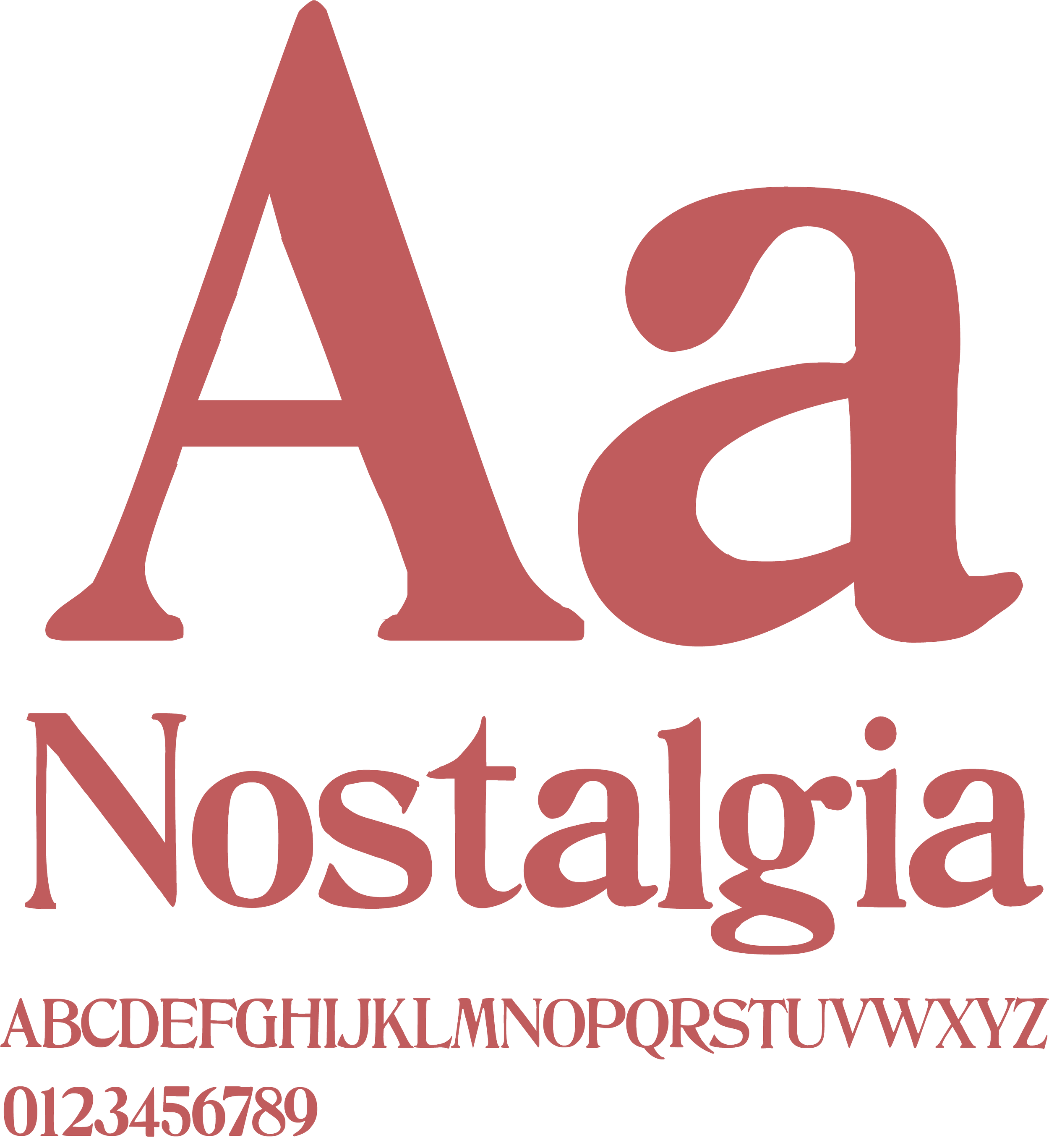
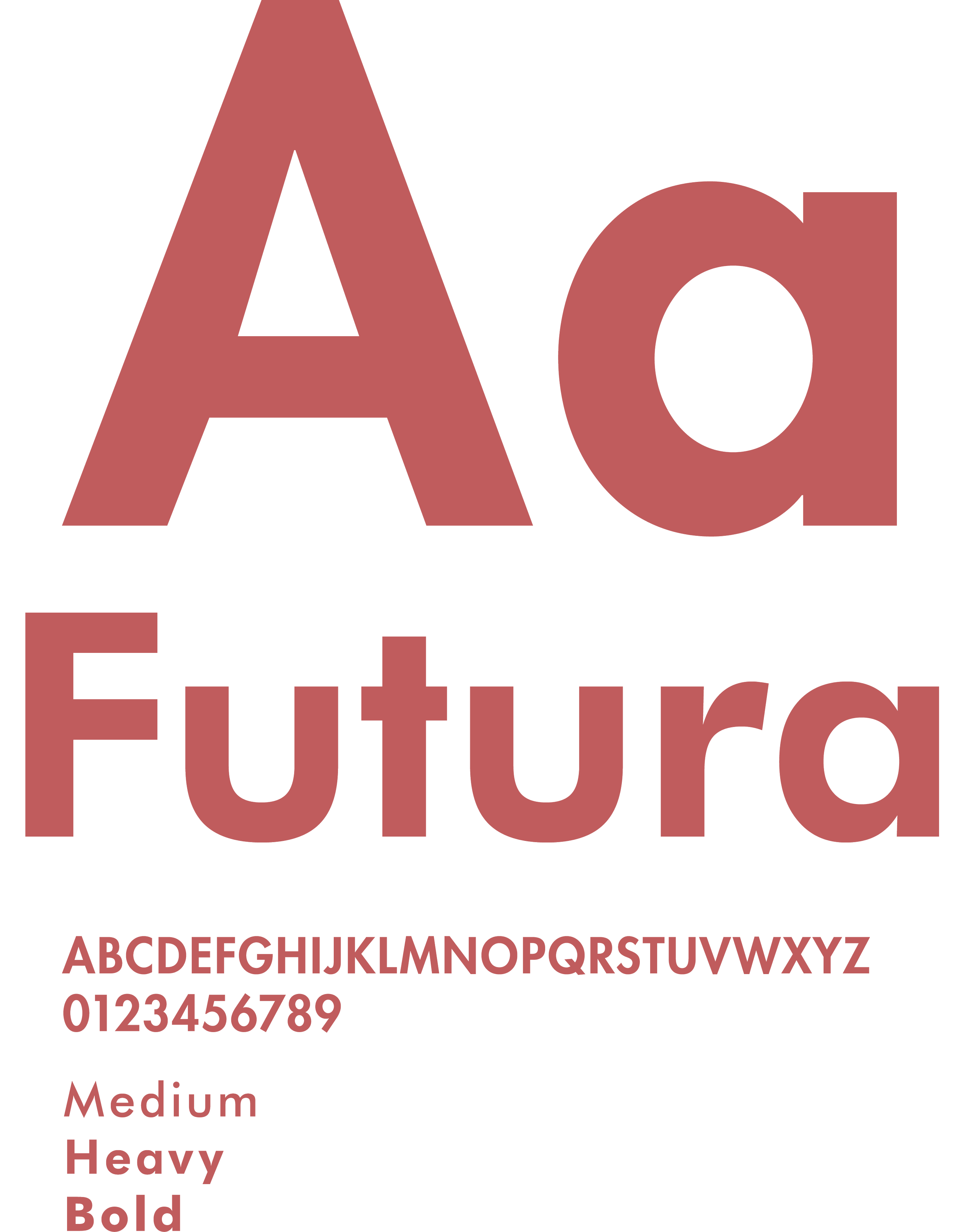
The Retro’s logo was designed with the intention of balancing nostalgic aesthetics with a 21st century visual presentation. This is achieved by contrasting the primary header logo typeface, ironically titled Nostalgia, against the timeless sans serif Futura. The colors were chosen with the same intent in mind, in this instance, reflecting the key ingredients.

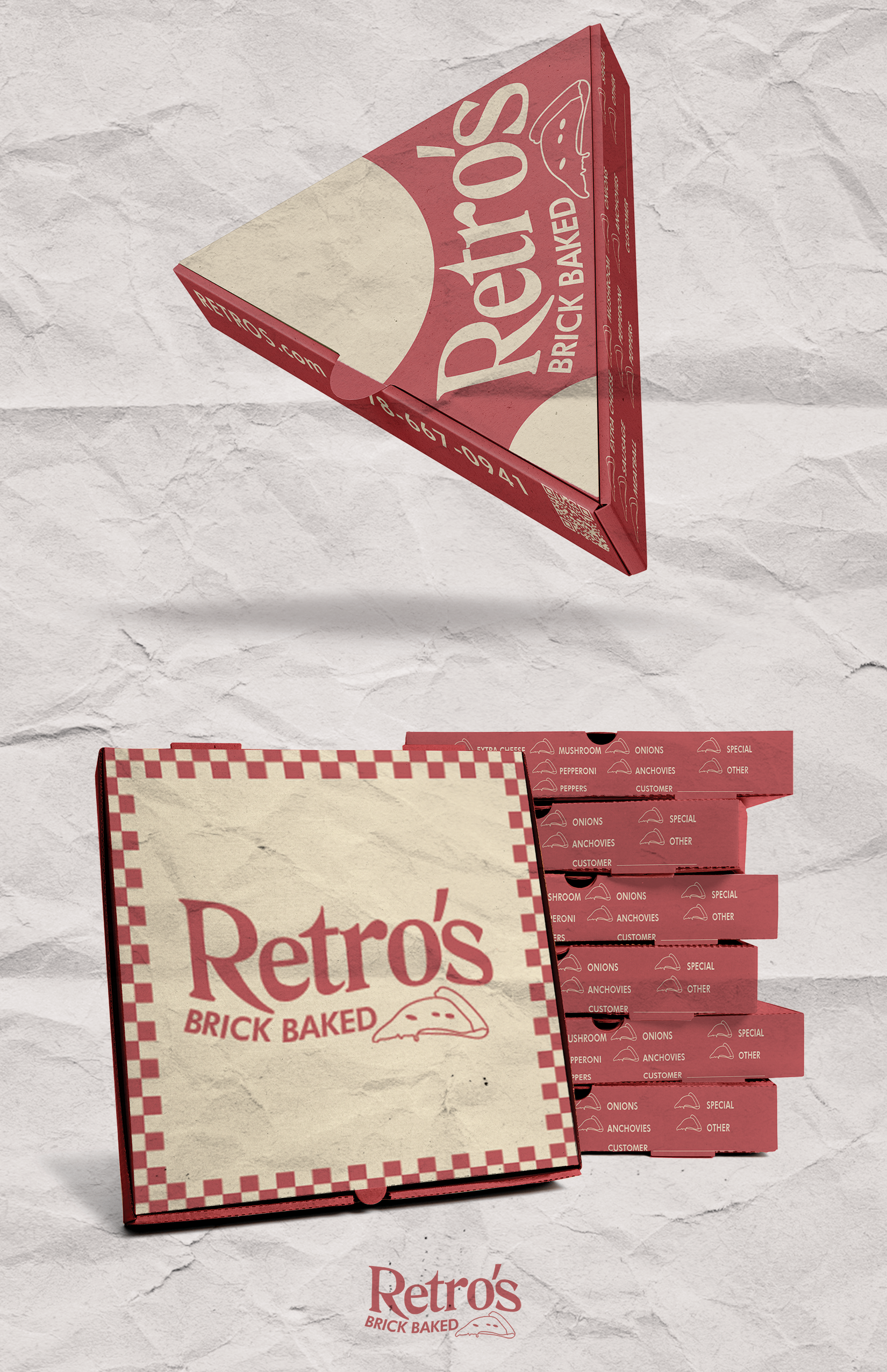
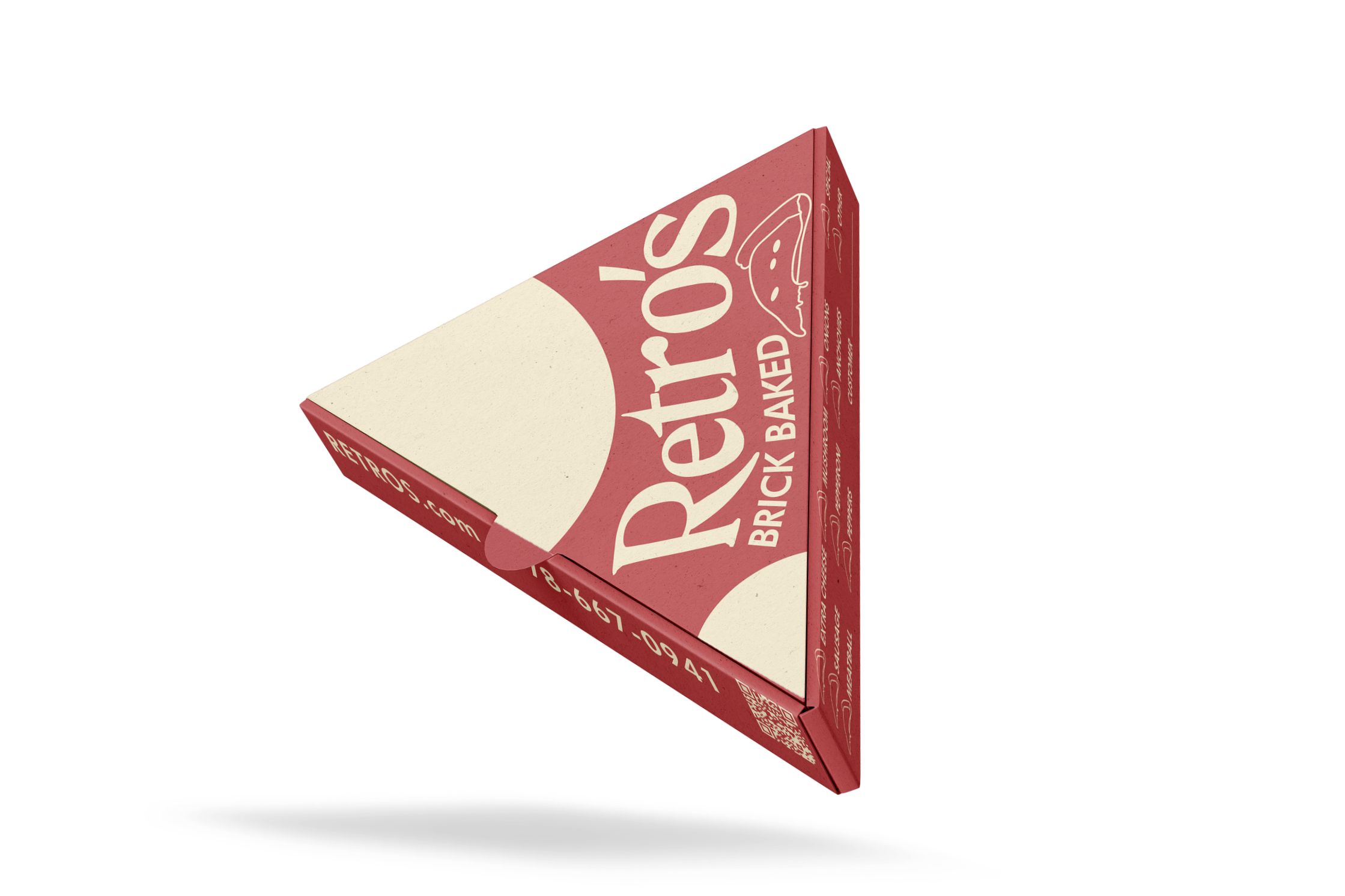
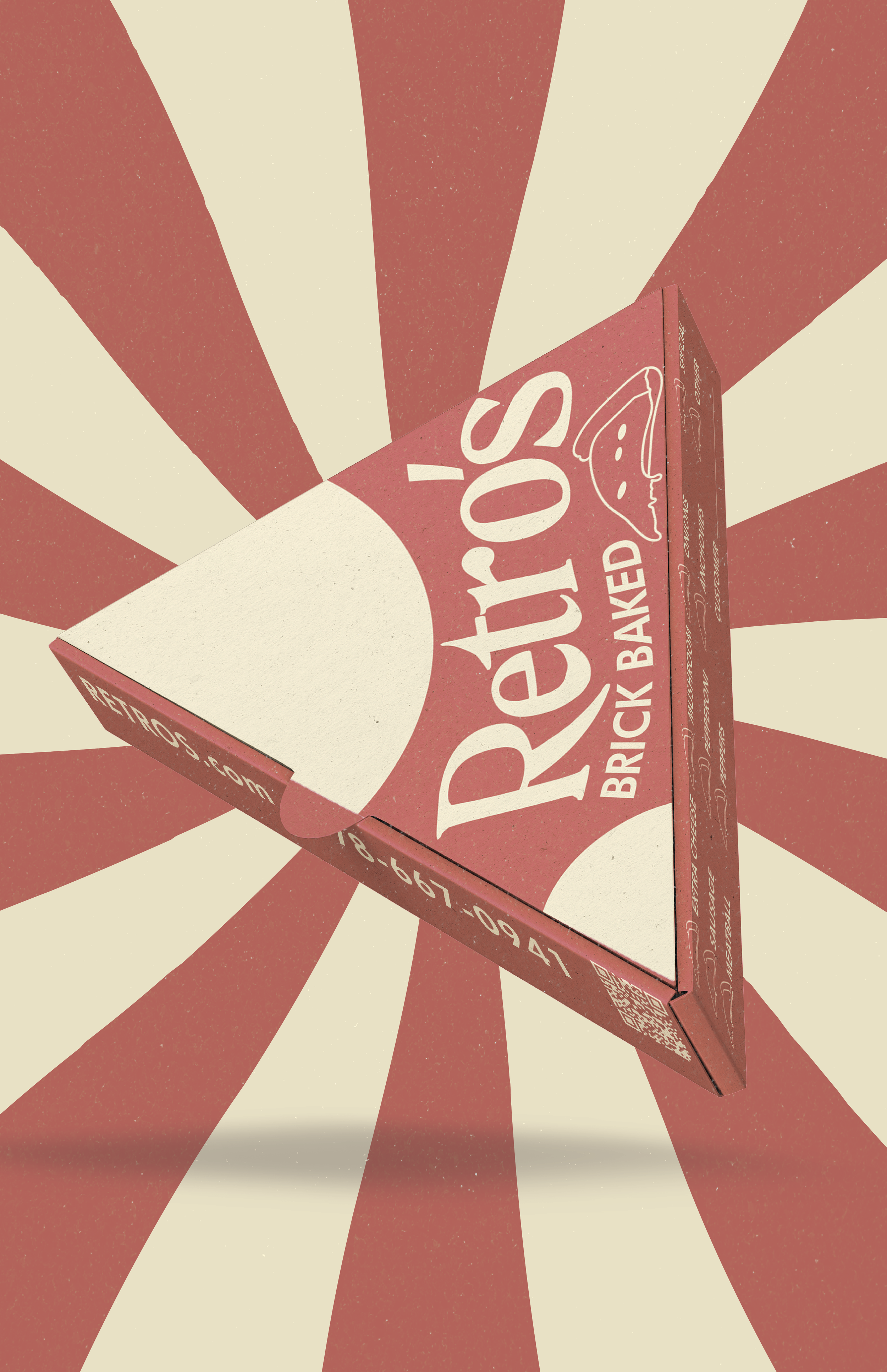
Retro's brand identity reflects the past, present, and future through its design. This is best shown through the single slice box; circular shapes abstractly represent the pizza's cheese drip over the box and break up the formality of conventional design/layout.
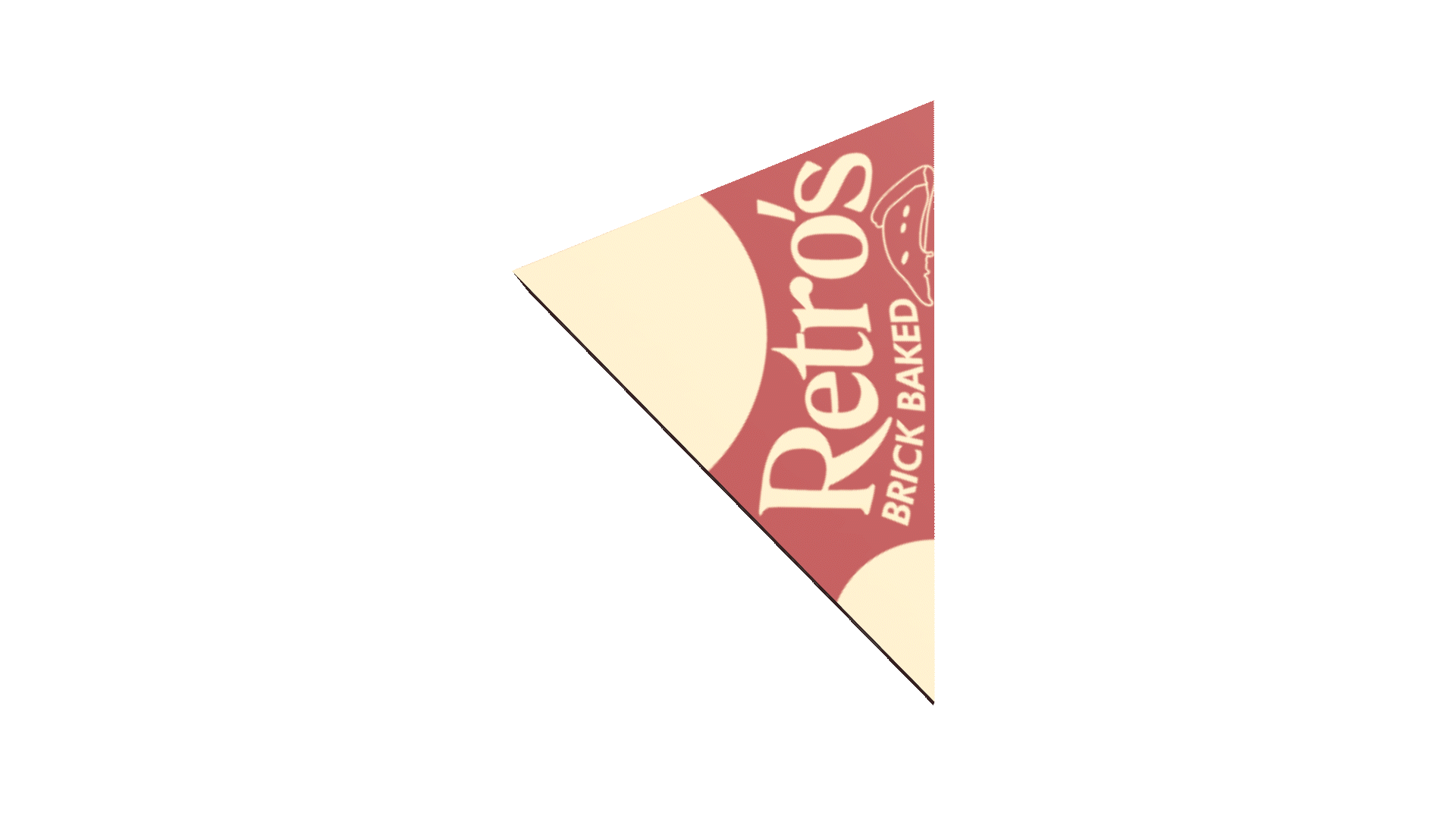
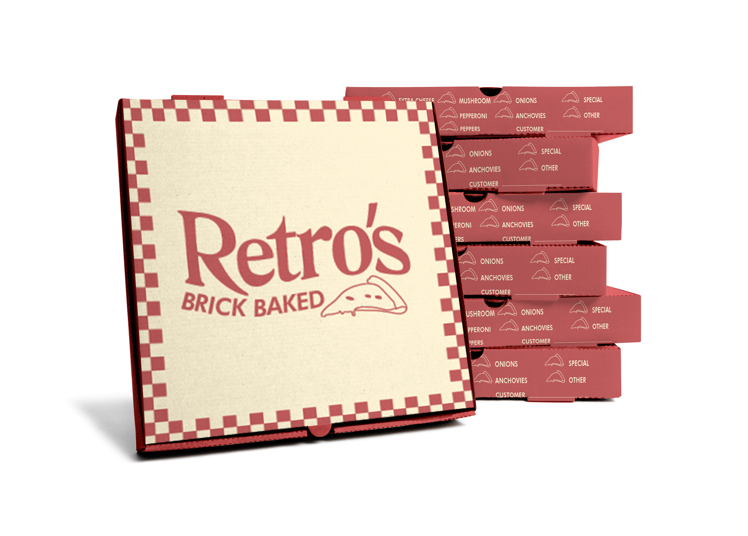
MOCKUPS