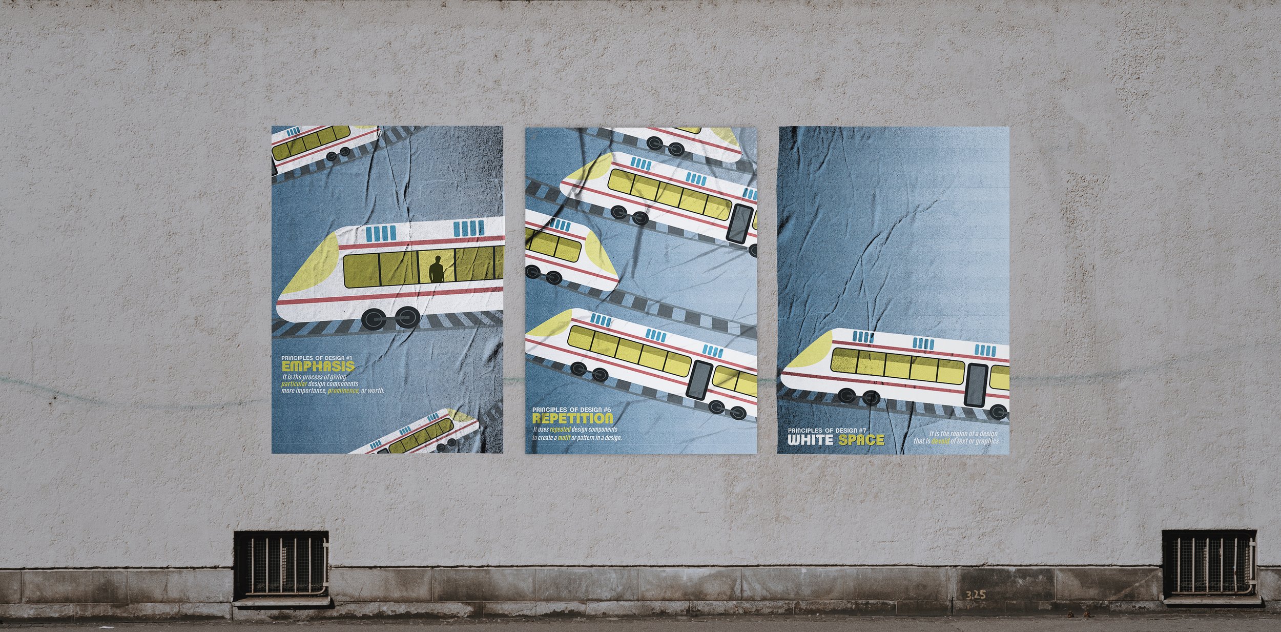
This set of posters was created with the intention of demonstrating several of the universal principles of design.
The particular elements I chose to highlight within my series were Emphasis, Repetition, and White Space.
Primary Elements -
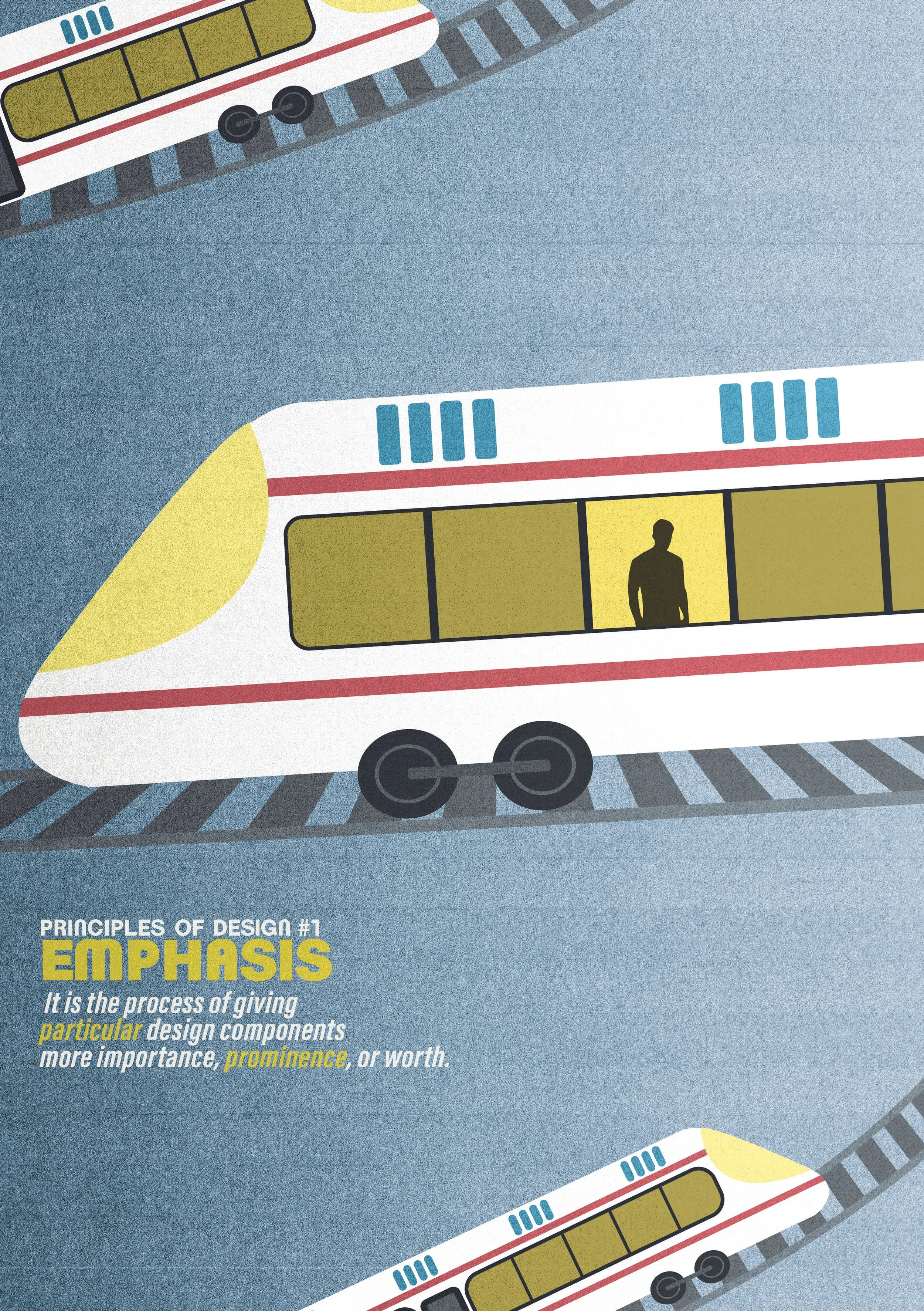
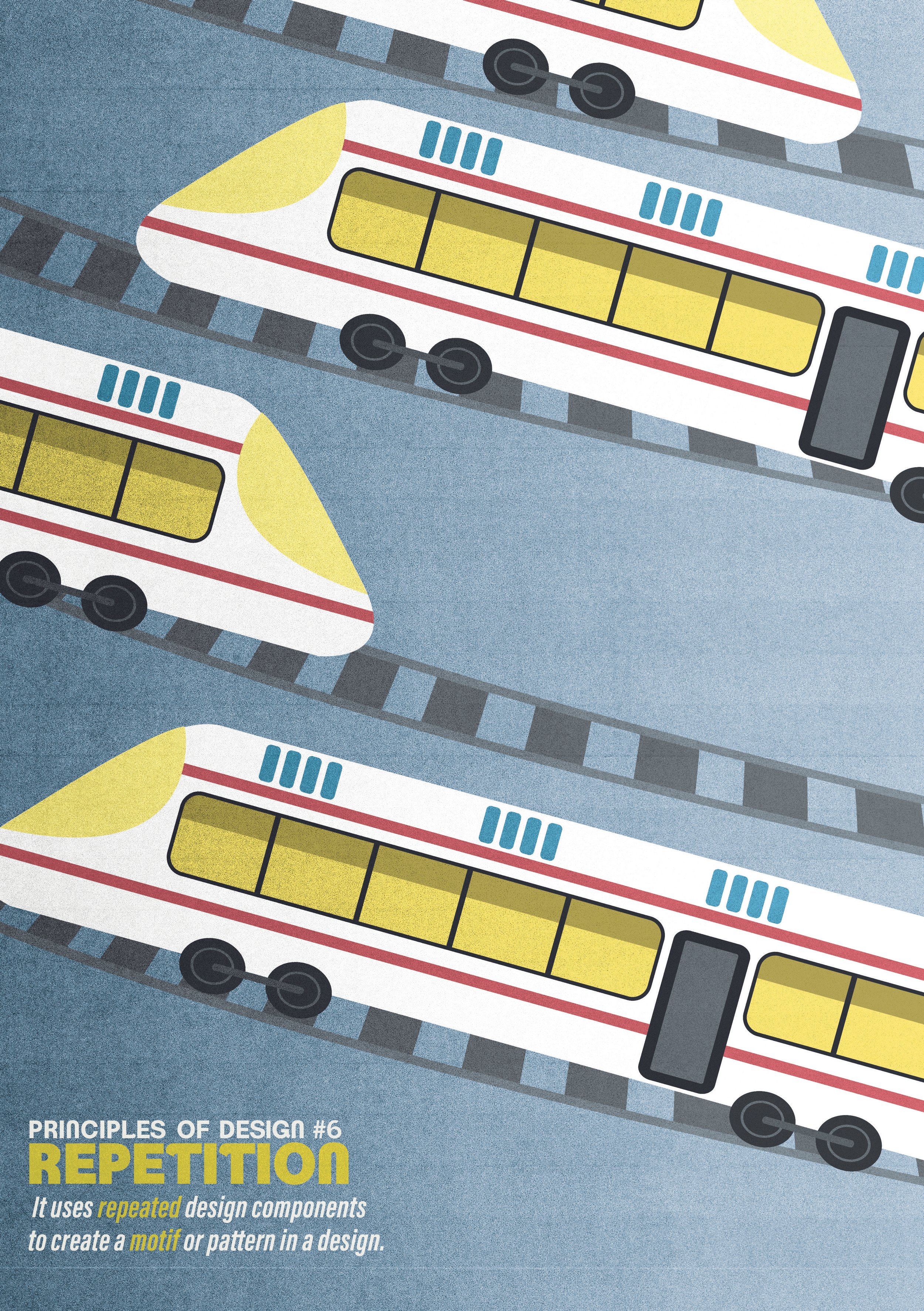
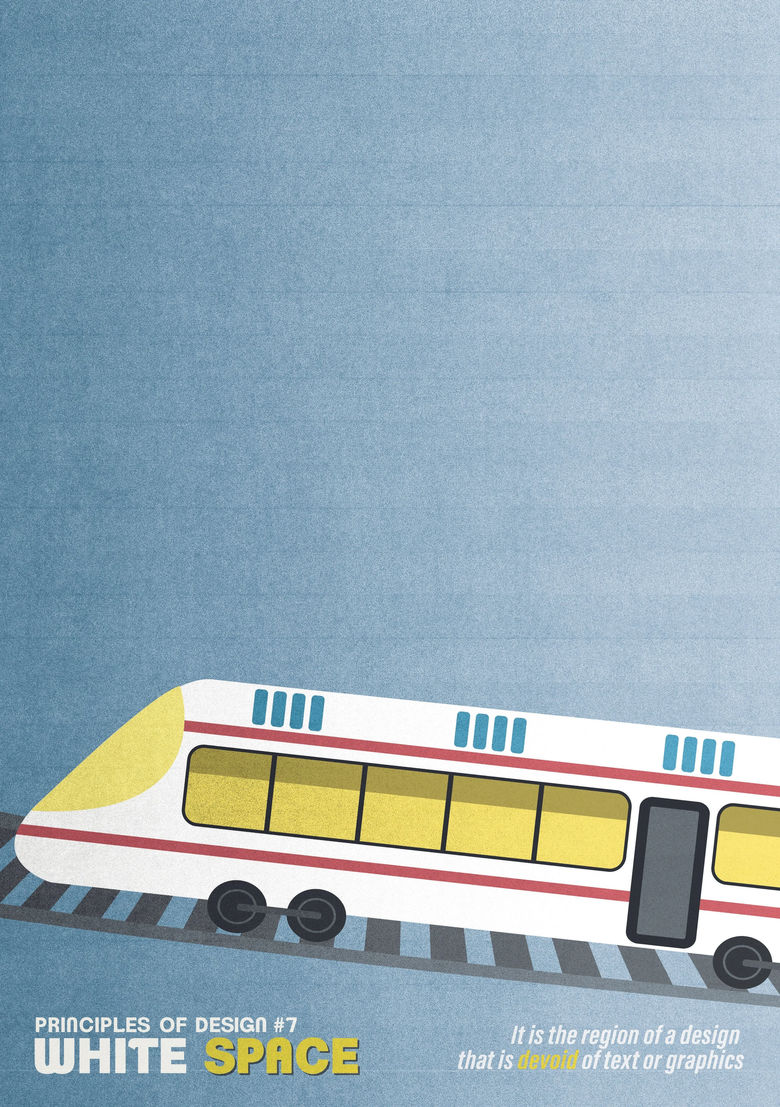
This series of three posters used a repeating design element, a modern train travelling on railroad tracks, as the cohesive unit to demonstrate the various principles of design with.
Changes in size, direction, quantity, and additional content such as visible passengers create sufficient variation in the train's appearance across the several poster designs.
The typeface used in the designs is titled Clemente PD, and is a stylized sans serif font that balances a clean foundation with fun angles and curves to reflect the winding tracks these trains are moving on.


For the Emphasis entry, I used a larger, centered train contrasting against smaller trains to give a sense of prominence. This theme is further amplified by the singular lit window in the main vehicle, highlighting the silhouette of a passenger.
For the Repetition entry, I duplicated the main train unit and arranged them in a stacking, alternating pattern that travels the height of the entire poster.
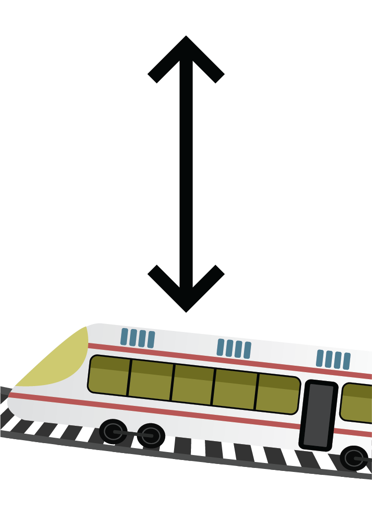
For the White Space entry, I let a single train sit on the tracks at the bottom on the poster, grounding the object in the scene and emphasizing the height in the negative space above the train. The lack of additional graphics illustrates the open area and draws focus to the train and information at the bottom in a similar method to the Emphasis entry.
FINISHED POSTERS